|
My artwork looks like a grey/blue hat in the front with a black square pattern in the back there is a logo on the right side of the hat and it is two capital b's. One of the b's is stacked on the other one. There is the state of Minnesota and it has an American flag. I colored that black and blue. My artwork was created with a pencil and markers. I used the pencil for all the outlining and then I used the black marker on the outlining. Then I used a grey that was 60% but had a base color of blue for the bill of the hat. I also used it for the front of the hat. The big idea behind my hat was that I wanted to draw something I really liked and the first object that I thought of was my hat. The goal of this artwork was to make it look exactly like my hat but it doesn't look that realistic as I thought it would. My overall thoughts about this artwork were that it looked very good but it didn't look that realistic. 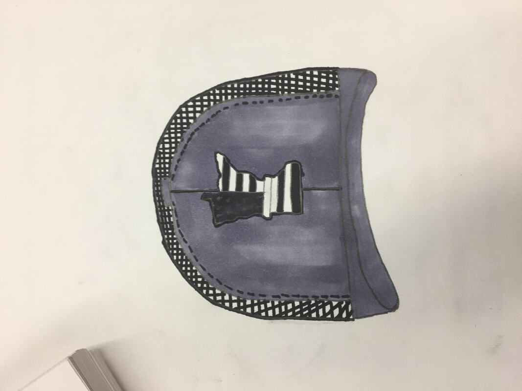
0 Comments
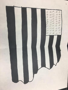
The other colored media that I had was colored pencils but the website wouldn't load the picture in. Here is the video that I watched on markers. https://www.youtube.com/watch?v=cIMcAA3FWY8, I used develop craft and I created an American flag. I also used Envision, I made this flag and then thought of putting it on my hat that I drew.
Two studio habits of mind that I worked on have been developed craft. Develop craft in the art world means, that I can use tools and materials to practice the ways of art. The other state of mind that I used was engage and persist. Engage and persist means that I can embrace problems of importance and develop focus within my my work. I worked on this every day for the past week. 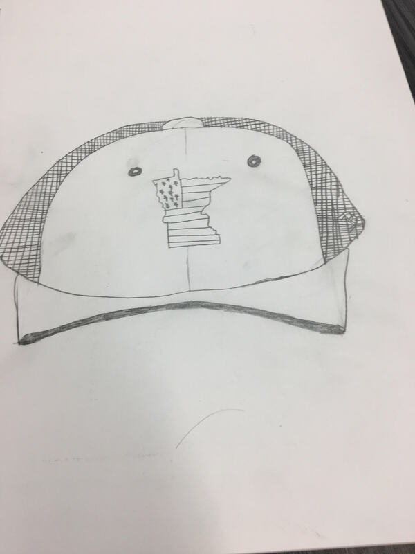 |
 RSS Feed
